6.12.Statistics
The telemetry service of contentACCESS permanently collects data from the
- contentACCESS system as a whole,
- email archive and
- file archive jobs
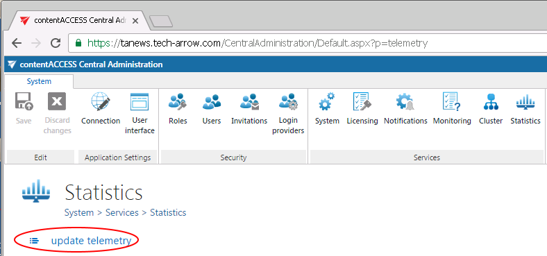
and makes a record of the collected data. The data changes are summarized into telemetry graphs. These graphs give a simple and quick overview about the actual data usage of the last 10 days. The graphs can be viewed on the Statistics page, which is reachable by navigating to System ⇒ Services ⇒ Statistics on the ribbon. The values displayed on this page are permanently updated by the telemetry job, which runs and collects the necessary data every night between 1 AM to 2 AM. If you want to see the actual usage data immediately, then you can run the telemetry updater, which will actualize it for you immediately.
The telemetry job’s configuration page can be opened by clicking on the “update telemetry” option. Only a user with manage tenant rights has access to the telemetry job. With clicking the option the telemetry job is automatically triggered, too.

A new scheduler may be created and resource settings may be changed to the telemetry job on this page. The job can be started/stopped or activated/deactivated from the same page’s status bar, too.
The telemetry information may be checked to the
- system as a whole– if the system tenant is selected
- given tenant – if only the given tenant is selected in the upper right menu:

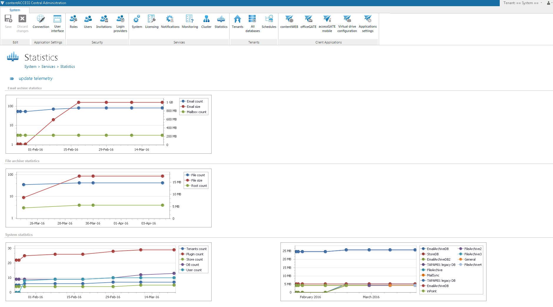
The given page is divided into 3 sections/4 charts. Any growth or reduction in the count of tenants, archived emails, databases, root folders count can be checked here using the respective graph.
- Email archive statistics
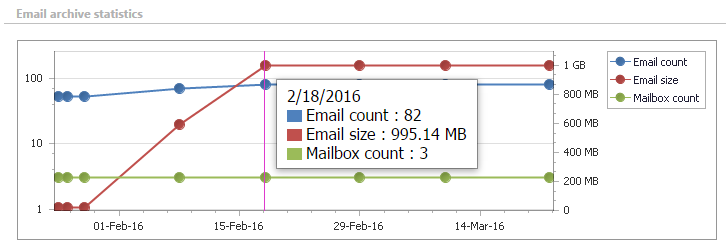
Left axis: displays the number of the archived emails (blue line) and mailboxes (green line)Right axis: displays the total size of the archived emails (red line)
- File archive statistics
Left axis: displays the number of the archived files (blue line) and root folders (green line)Right axis: displays the total size of the archived files (red line)
- System statistics
The 1st chart displays the actual count of tenants (blue line), plugins (red line), stores (green line), databases (purple line) and users (light blue line) depending on the selected day. Move with your cursor over the grid to view the exact values in the given time period.The 2nd chart displays the size of the configured databases. Each database is marked with a different color.

The actual information is displayed with moving with the cursor over a given date in the chart.


